-
Category:
Graphic design
-
Date:
Jul 2021
Overview
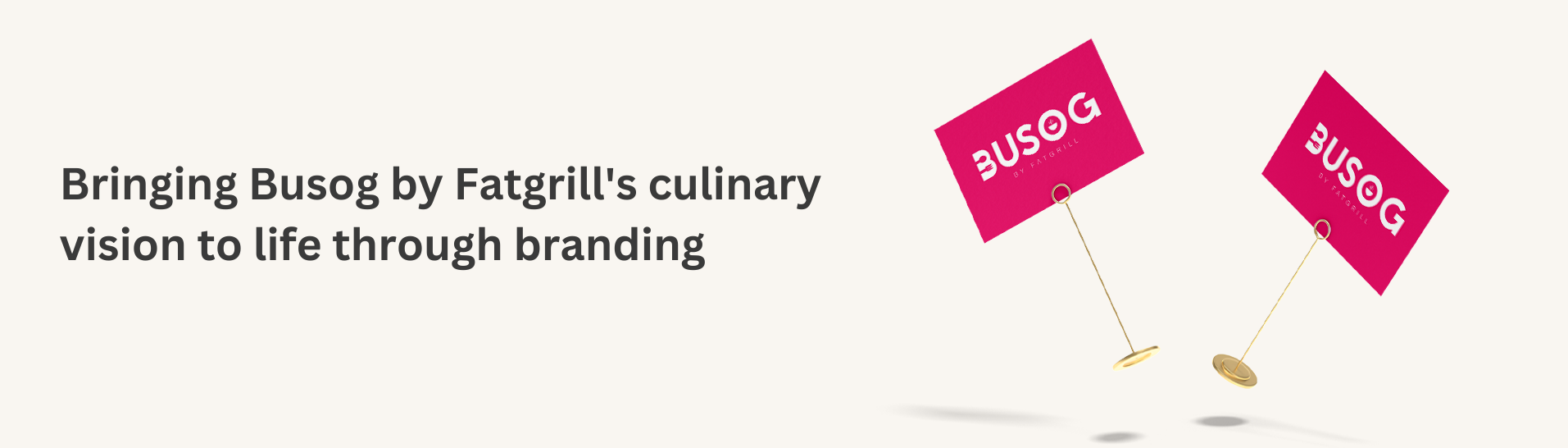
Busog is a new pop-up restaurant by the Fat Grill restaurant. They serve Filipino comfort food that is easy and accessible for passersby.
Problem statement
The client wanted to create a brand that highlights the quality of being full, which is “busog” in Filipino. They already had this brand name in mind and wanted to create a branding that simply shows how this restaurant provides good food.
Role & audience
I am the designer in this project responsible for the branding of the restaurant. The market of the restaurant is from A-D, which is generally all that can enjoy the good food.
Process
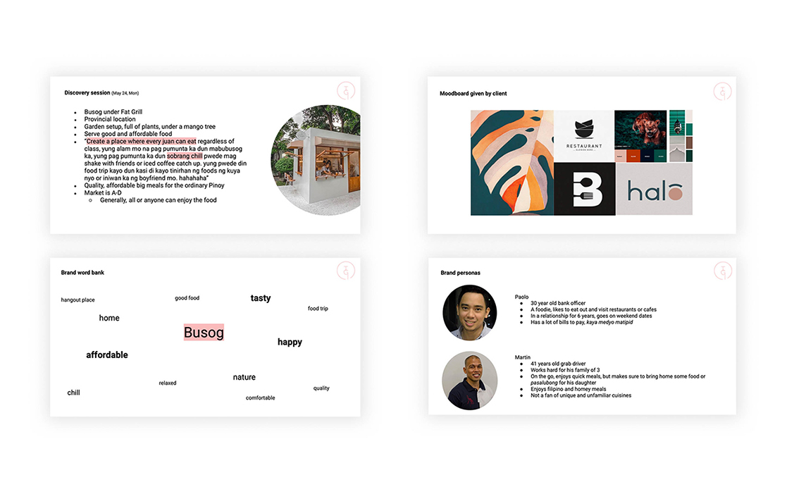
Discovery session
I was referred to by my friend to create the branding of this new pop-up restaurant. When I met the client, he was vibrant and jolly in showing the plan for his new restaurant again. The new restaurant would be found in the province of Batangas. He showed me the peg of the place, which was in a middle of a plants and pots. The garden like location was beside a highway which makes the pop up very accessible to any passersby. He really just wanted to highlight how the pop-up serves good and affordable food.
Brand questionnaire, brand personas & moodboard
To learn more about the brand, I sent my usual branding questionnaire to their team. They wanted to highlight that they serve quality affordable big meals for the ordinary Pinoy. It will be for all families that can enjoy the food while in the midst of a delightful provincial setup.
"Create a place where every juan can eat regardless of class, yung alam mo na pag pumunta ka dun mabubusog ka, yung pag pumunta ka dun sobrang chill pwede mag shake with friends or iced coffee catch up, yung pwede din food trip kayo dun kasi di kayo tinirhan ng foods ng kuya nyo or iniwan ka ng boyfriend mo hahahaha" — Busog's owner
With their answers and input, I’ve collated them and came up with the brand word bank, brand personas, and added to the moodboard they sent.
Busog branding deck slides
Brand studies
I shared a total of 4 studies. Each showcases the element of eating as it is the main service of the brand. The typefaces suggested were bold to signify the brand’s name. They wanted to highlight letter B, so the brand elements were applied to that letter. Since this is under the Fat Grill restaurant, which already has a pretty big name in the provinces, the main restaurant’s name is just also mentioned in the logo.
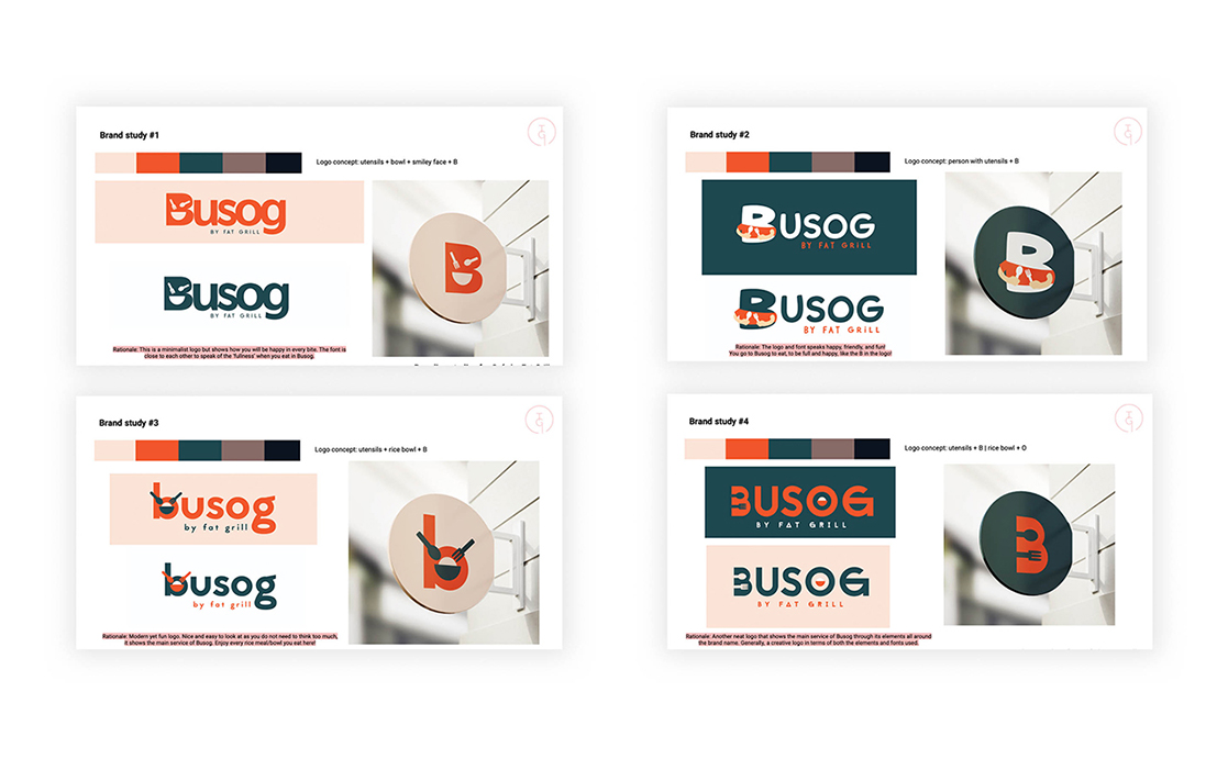
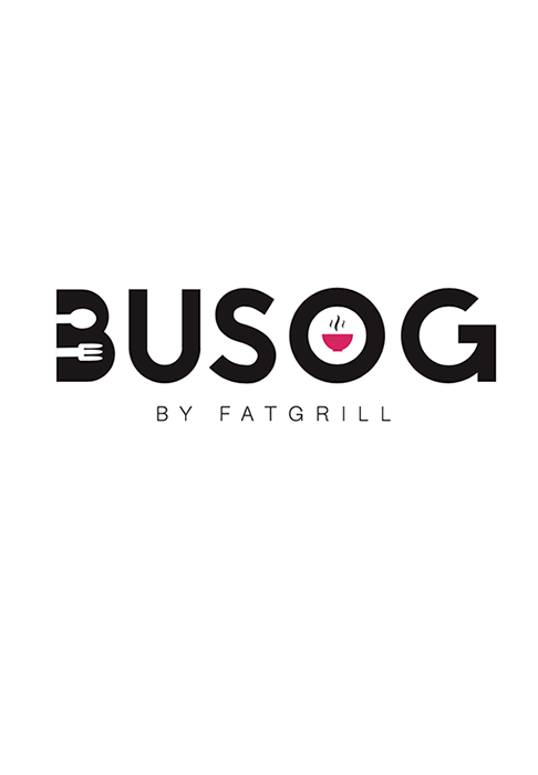
The final logo chosen was the fourth study. They wanted to be different from the usual orange/red color palette of the restaurants and wanted a black/pink scheme to their brand. After a few revisions and adjustments, we've come up with the final logo of Busog.
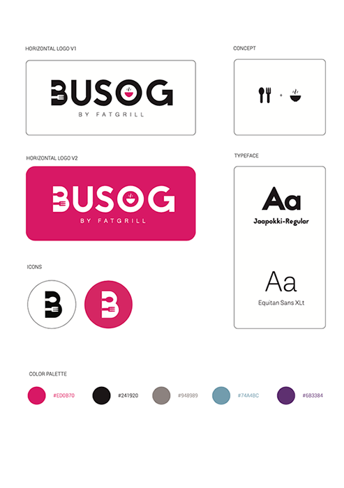
Made with Adobe Illustrator
Results and lessons learned
The Busog logo highlights the letter B with the use of a bold font, to stand for the meaning of busog which is "to be full." The incorporation of the utensils in the brand's initial highlights the main service of the restaurant, which is to serve you good food. The additional bowl element tells us of the kind of food that is served in the restaurant. This includes stews, specifically the traditional Balbacua, a Filipino beef stew, which the client really wanted to highlight more in the restaurant.
Busog officially opened to the public on July 16, 2021. It offers a good menu of Filipino dishes enjoyed by many.
Busog by Fatgrill located in Lipa, Batangas
Project takeaways
At first, after the discovery session, since the client talked about the serenity and provincial setup of the location as well as calling it a cafe, a part of me wanted to suggested a different name and take to this kind of setting. When they also showed the minimalist aesthetic cafe peg that they had, I first thought how having a different name would fit the place’s cafe vibes. With that, I did research and suggest names such as Siesta (meaning to rest) or Duyan (meaning a hammock). The clients then responded saying that they really just wanted to have Busog as its name and later just removed the cafe aspect and turned it into a pop up restaurant that focuses on the food. They also cleared out what they want from the questionnaire and better communications that we had after the.
From here, I realized that it is really best to have good communications with your client for you to better understand what they want for their brand. Surveys and interviews are an essential aspect in your research. It is important to do this part to design better for your client. At the same time, it is still okay to suggest and give inputs on what you think as well. Even if things do not get approved or do not push through, you have to not be discouraged. Alternatively, through this kind of experiences, you get to be a become a better and more efficient designer for your future projects.
Thank you to Mr. Jared Sto. Tomas as well as Ms. Jenna Zantua for trusting me in creating the branding! Big thanks as well to my friend, Clarisa Guerrero, for referring and trusting me to take this on.