-
Category:
Graphic design & videography
-
Date:
Nov 2019 - May 2020
Overview
For the 25th year of the organization, the logo and overall branding of Ateneo Management Information Systems Association (Ateneo MISA) was revamped to effectively promote the org by forming a brand image that is more modern and appropriate for the current society to properly advocate the orgs values and core competency: social transformation through information management.
Problem statement
The current logo of Ateneo MISA is outdated and inconsistent to the current branding of the organization. This has also been a topic that rises amongst members and alumni, and discussions of rebranding the logo come from time to time.
“When will you guys change the logo? it’s so old already”
"The MISA logo font is not that nice, it looks old and very technical”
“There’s actually an offset in the hexagons in the logo, it was a mistake 6 years ago that was never fixed”
— Feedback from members & alumni
As the Vice President of Communications 2019-2020, I did agree that the organization’s logo seems outdated and unmatched with the branding that the organization is trying to portray. With that, I wanted to make sure that I will be able to slowly incorporate the needed changes for the image of the org during my term. It was also just the right time since it was the 25th year of the organization. Together with the celebration of this milestone, a rebranding can finally be done.
Role & audience
I am the Vice President of Communications. I acted as the sole main designer and videographer for this project. The audience will be the Ateneo MISA community, the rest of the student body, and even all business and technology enthusiasts that advocate the same principles.
Process
Research & analysis
To properly accomplish the rebranding, I evaluated what the organization currently has as image. There were three main aspects of MISA’s brand: teal, hexagons, and the robot mascot (MISA Bot). To start, prior my term as both AVP then VP, the latter has already been changed into a friendly vector illustration of the mascot, therefore, there was no changes to be done with that, but instead there was then a need to make the logo fitting with this earlier change of mascot style as well as a clearer definition of the organization's brand. What I focused then was the two former elements mentioned, since these two were the symbols that you will instantly remember when you hear the name of the organization, thus I did not want to stray away from that strong and stable figure association already made in the 25 years of MISA. The current logo had a rugged text of the words MISA, with the long title at the bottom, and outlined hexagon logo that come in teal, black, and white. The logo is fitting to the old mascot of the organization, I must say, but it does look outdated and too technical because of the choice of font. Also, the outlined hexagons and the single dark hues of the colors used made the image of the organization dull and sluggish to what MISA actually is.
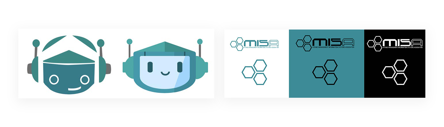
MISA bot rebranding few years back vis a vis current MISA logos
Goals & rationale
What I wanted for the rebranding can be divided intro three main goals:
1) Maintain the curent brand recall of the organization
2) Showcasing the values and identity of the organization
3) Have a more modern and friendlier interconnected image
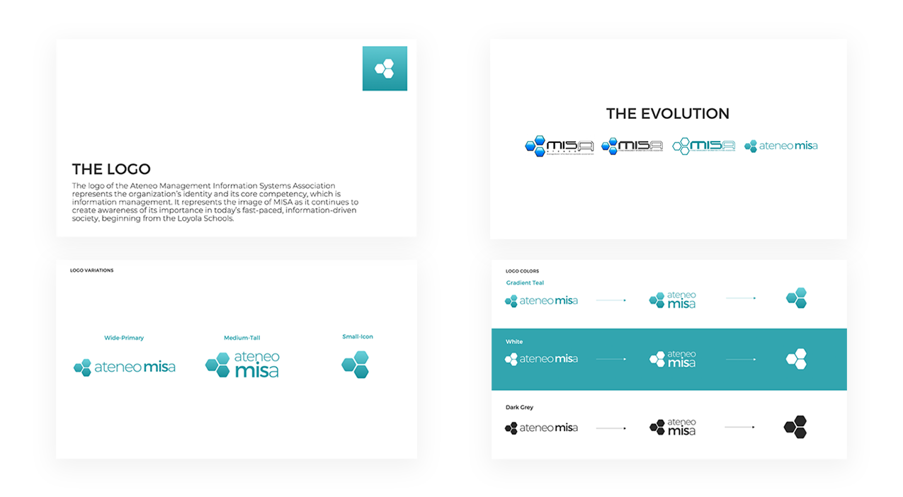
Proceeding still with the second one and introducing the third reason, as the organization is both focused on Business and Technology, there is then a need to change the font of the logo as it seems too technical to the eyes as it has rugged edges. The change of the text to Montserrat, an elegant smooth font, would not only be pleasing to look at as it is modernized well-designed web font, but it allows one to see the org's business technology side. It is also noted how the current logo's hexagons had sharp edges, it is part of UI design that rounded edges are "easier on the eyes than a rectangle with sharp edges because they take less cognitive effort to visually process," with this taken into account, as a designer and given that MISA also does Web Development services (thus advocating proper UX/UI as well), I made the hexagons have rounded edges to appear friendlier to the viewer and also to show how the organization has this kind of friendly attitude to its members as well, amidst its formality in nature.
The Communications VP for 2018-2019 or the one before me, also expressed before how dark the teal used in our logo (or brand) is. Remembering this and wanting to make the new brand more modern and friendlier as stated in the third reason, I made the teal a bit brighter and also in gradient. Not only has it been a trend recently, but the combination of the two to three shades of teal gives life to the brand of the organization. As gradients allow the image to be "memorable, unique, realistic, and colorful," it allows the viewer to see the image of the org with more depth. The change in logo in general also makes the current mascot (which. as mentioned above, has been revamped already) be more fitting and connected with each other. It helps a member of the org understand what the org is trying to portay: a business technology organization that is firm to its advocacies yet a family to its members. From these identified factors above as well as having constant consultation with my Associate Vice Presidents and fellow Executive Board members, I ended up with the following rebranding.
New logo release & merchandise
The logo comes with three variations the wide primary, medium tall, and small icon in teal, dark grey, and white. Plus, an additional one color small icon logo and a default image logo for profile photos. I decided to have versions of the logo so that it can elevate the organization's brand more through having options that can be used depending on the type of medium it will be placed on.
MISA rebranding
Ateneo MISA’s rebranding was released through a teaser and final video. The teaser reflected what we do in MIS through representations like diagrams, developing, and designing. While the main video, given the 25th year mark, I wanted to feature old officers as well as the current one. The script that I’ve written focused on our vision, mission, and core values for the viewers to see what we believed in. It showcased different videos of the org showing all the fun and bonding events. This rebranding marked not just a new logo, but also what we’ve accomplished from the past years.
Teaser video made with Adobe After Effects
Made with Adobe Premiere Pro and Adobe After Effects. Watch on Facebook
For this year's rebranding, the organization also released its t-shirt merchandise for its 25th year featuring the new logo.
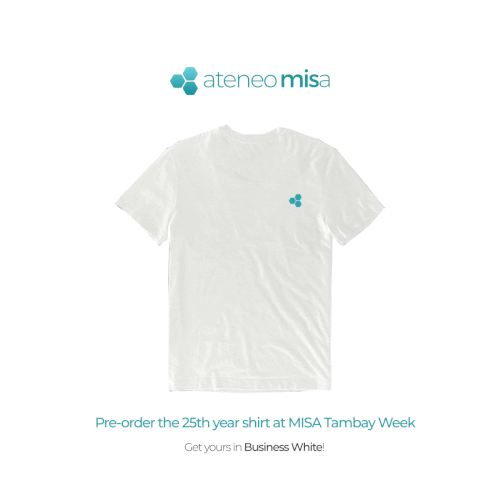
MISA rebranding merchandise
25th BETA & 25th year videos
This annual project by the Communication Cluster was made to present the board of the executives and the associates for that academic year. It was the main medium for the people behind the organization to be known and recognized by the members. Similar to how I started it last year when I was an AVP, I planned to create videos for the clusters, profile photos for each officer, an album showing all of BETA, and additional new teaser to start the project. Meet the BETA 2019-2020 fulfilled its main purpose of recognizing and learning about the board and their associates, who work their hardest to make MISA achieve its goals during the term.
Made with Adobe Premiere Pro. One out of the four videos created, view the other videos on Facebook.
As the last project for the academic year, I wanted to properly end my term with a promotion that would commemorate and encapsulate not only the BETA 1920 signing off but also the closing of the 25th year anniversary of the organization and our rebranding. My main concept of the video was simply to showcase the 25 years that the organization has gone through in a short video that the members would easily watch when they see it online. Thinking of how 25 would be an essential number for the post plus emphathizing to an user's tendency to skip over long videos, I decided to slap on having the video in only 125 seconds (approx. 2 minutes).
Made with Adobe Premiere Pro
Results and lessons learned
The rebranding was launched on all Ateneo MISA’s social media accounts. It has garnered good feedback and attention from the Atenean community. From the rebranding video that had 2,200+ views until the last 25 years video that had 3,100+ views, there had been numerous support from the officers, members, and alumni. Through the use of the rounded hexagons, gradient teal, and a sans-serif typeface, the rebranding was now able to transform a flat, outdated, stiff, and a too ‘technical-like’ kind of design into a modern friendly elegant with color dimension that is still familiar and ideal for a business technology organzation made for society transformation.
Project takeaways
This was a major project done by Communications for the year. Rebranding is not an easy task as it will totally change a lot of the promotional, communications, and the organization image. I am thankful to all that helped and supported me in my term. I do admit that there is always that constant challenge in being part of the creatives through the repetitive cycle of researching, empathizing, visualizing, creating, and revising under a very strict deadline at hand. This heavy task combined with the harsh workload of my major, specialization, and minor is no doubt a scary obstacle I had to go through. However, looking back, I only realized now that despite it being a hard responsibility, I didn’t feel so much pressure coming from it. It then occurred to me that the main reason for me feeling this kind of comfort is because of how I enjoyed my work and position. It felt great and fulfilling to do something that I loved doing for the organization. It is very important for you to know the ‘why’ of what you are doing. You must allow yourself to experience the job from both its ups and lows to be able to find your reason for staying. I firmly believed that the Communications Cluster is the bridge of the organization to the members and non-members, and it is up to us to showcase what MISA truly is. It is in our hands to present our vision, mission, values, and basically what we can do as an organization. Through my cluster, we are able to show how tech powered and business minded individuals can also be creativity inclined in our own ways.
Thank you to my Associate Vice Presidents Mae Buhain and OJ Trinidad for working with me in this major project of the Communications Clusters. Our term was a success with all of us together, and I will be eternally grateful for the experience and opportunity!