-
Category:
Graphic design and UX/UI design
-
Date:
Oct 2020
Overview
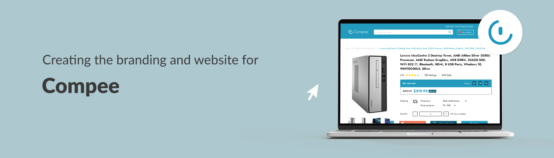
Compee is an e-commerce that sells computer related products and services. It aims to deliver gadgets and electronics in a lower price to Filipinos.
Problem statement
The client want to create an e-commerce business that has its own website. Compee should highlight not only their computer services but also their loyalty and trust to their customers, especially given the kind of products they offer.
Role & audience
I am the graphic and UX/UI designer of the project. The audience is for all Filipinos that would need computer related products and services, so highlighting but still not limited to the tech-savvy shoppers out there.
Process
Briefing & discussion
I was a late addition to the project since the previous designer left. That person had created old designs for both branding and UI, unfortunately, receiving some criticisms in terms of the design colors, layout, etc., as it was not fit for the proper user experience. I was briefed about the project by the team, and told me what the clients are looking for. They wanted to create a website that “looks legit” and a brand that can be trusted by customers.
With that, I decided to start from scratch and recreate it to a more minimalistic and modern design perfect for computer e-commerce business brand.
Research & brand studies
The original logo created was a power button to connect to the computer aspect of the business. The client did not really have any idea for what they want also for the logo, except for it to have the color blue and something related to the computer.
With that, after research and knowing more about the brand/product, I came up with 3 brand studies using different computer elements. Since the business is an e-commerce, which in itself is already a modern business, I wanted the logo to have a modern and minimalist take on it. I also wanted the brand to be incorporated in the logo therefore each study had the letter C in the icon to stand for Compee.
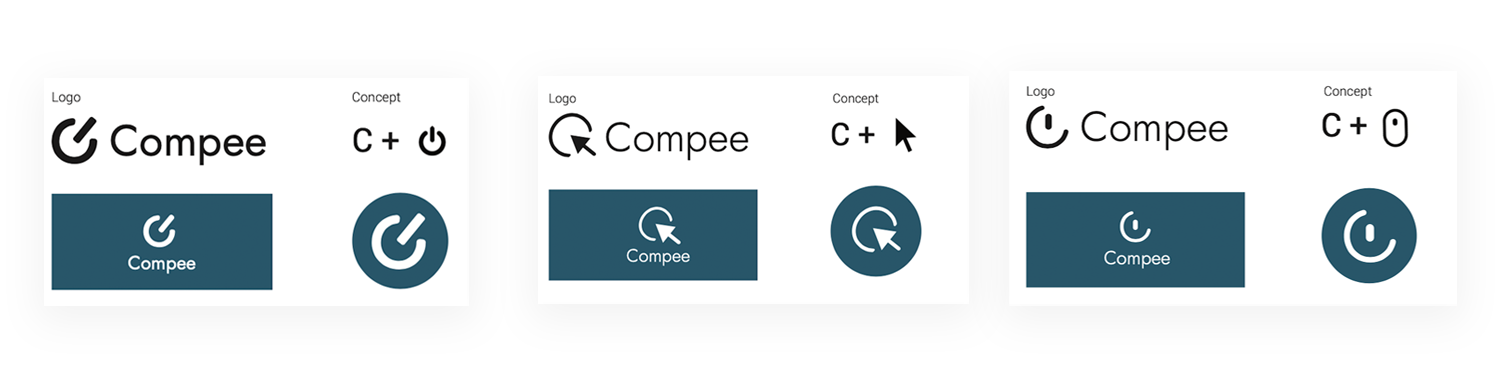
Brand studies
Brand logo
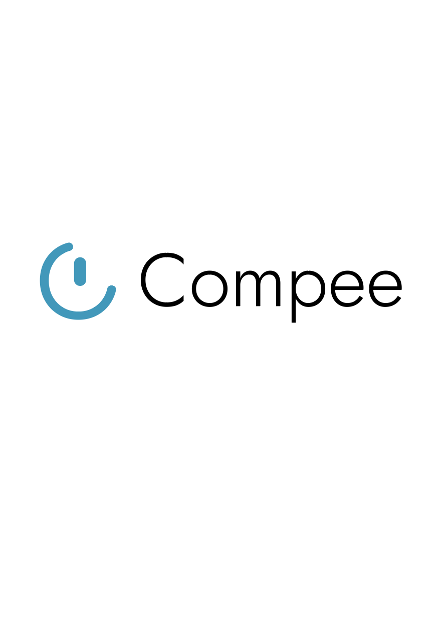
The client liked the third study the most. Their only request was to make the blue a bit brighter. After consultation and feedback, we ended up with this final branding.
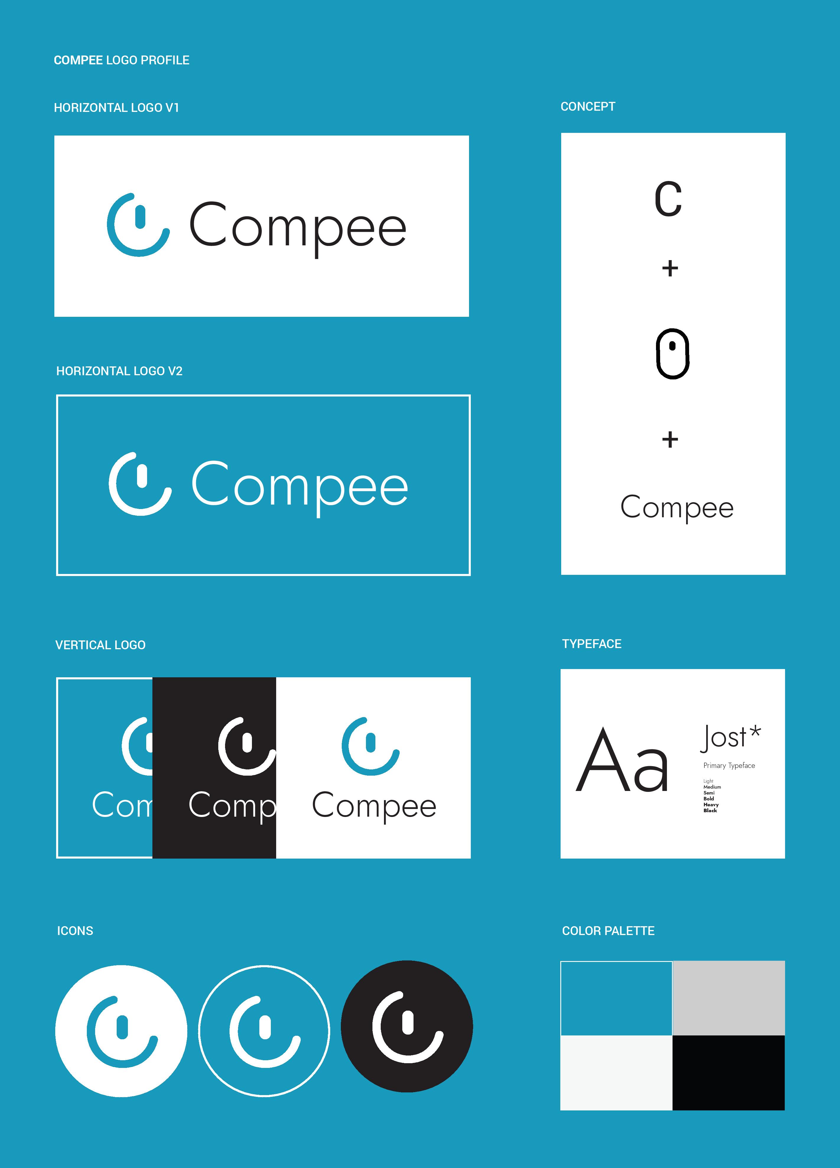
Made with Adobe Illustrator
E-commerce research & analysis
Amazon was used as basis as there is a wide array of electronics, gadgets, and computer-related products found in that website, which can be the closest market to Compee’s. This was also the only website peg given by the client, as they had said that the main goal of the website design is to make it “seem legit.”
I researched furthermore regrading e-commerce websites like Shopee and Lazada. Since these are what Filipinos mostly use for online shopping, I paid attention to its user experience as basis for the prototype. The user should have the same feel and familiarity when they use Compee’s website. As mentioned in Jakob’s law, one of the laws of UX, it is better to have familiar patterns in design for the ease and efficiency of use of the users.
E-commerce websites commonly used as references
Prototyping
Given that it is an e-commerce website, there were really a lot of pages needed for this, for all buyers, sellers, services, and even for the admin side. The client wanted their website to have a cart, wishlist, comparison, customer service, etc. Upon the continuous communication with my three fellow developers and the client, here are the screens that I have come up with.
Made with Figma
Results and lessons learned
Compee has launched on Facebook last Oct 2020. They are offering computer products and services as well as gadgets sourced locally and from the United States. Unfortunately, the website is left under development and discontinued by the client.
Project takeaways
Given the time and constraints, I was not able to have a deeper research for Compee’s branding. Although, even with minimal research, the client did not have a lot of complaints with regards to the studies and final logo, I believe it would’ve been better to have proper research to have a stronger profile. Similarly, I wasn’t able to do any UX research aside from the informal competitive analysis with the e-commerce websites and the application of the UX principles. The main source of feedback and testing were only from my team and the client as well. Since this is an e-commerce website that tackles a bunch of pages and use cases, it would’ve been better to have m more research and analysis as well like the branding. Research and analysis are important to have a better landscape of the business as well as to make sure that the users’ goals are met, so with whatever time frame or resources you have you should do what you can to understand what and to who you are designing for. Minimal research is still research!
Thank you to Meg Tuason, Miggy Pinaroc, and Juls Navarrete for being the developers in this project.
Other graphic design and UX/UI design projects
Bear Bakes branding and communications
A small business that sells cakes and other baked goods with a bear as its main icon
Santa's Real Elves
An interactive article that shares three narratives of people working during Christmas
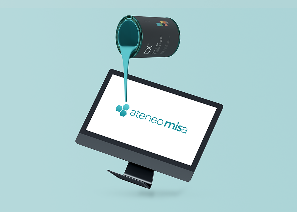
Ateneo MISA rebranding
A business-technology college organization that advocates social transformation celebrates their 25th year with a new logo
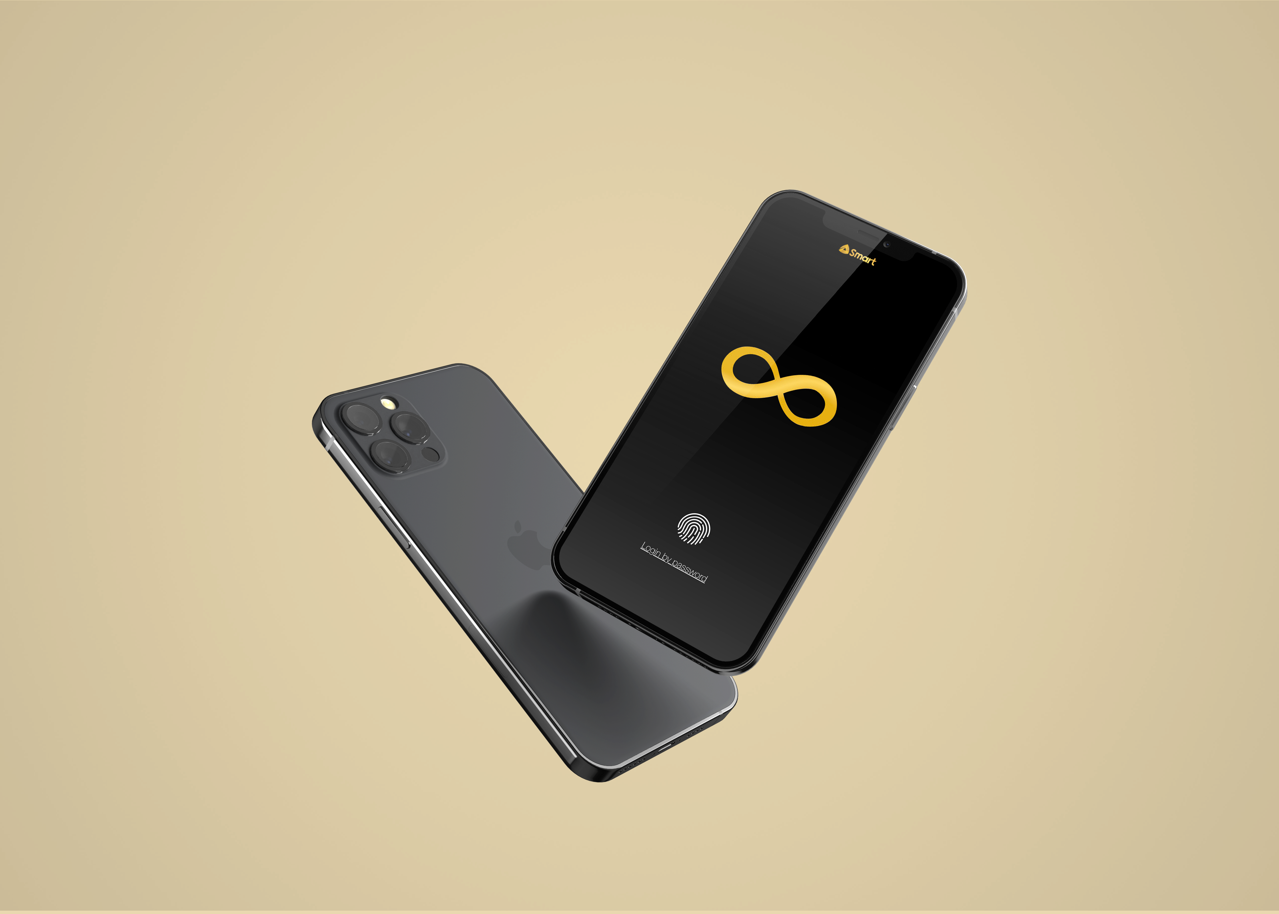
Smart Infinity app
A mobile application made for the telecommunications' platinum users