-
Category:
UX Design
-
Date:
Oct 2021 - Mar 2023
Overview
To further improve the Memo.ph experience as well as prepare for productization, new features and enhancements were conceptualized and introduced to the users.
Problem statement
With Memo.ph already adopted to the everyday activities of most teams in the company, the main objective was to continuously elevate the user experience of Memo.ph through thoughtful design and feature improvement.
Role & audience
As a key member of the Memo.ph team, I played a crucial role in driving the continuous improvement phase as the Experience Designer. I collaborated closely with the product owner and development team to ensure that the new features were aligned with the overall product vision.
New product features & enhancements
Card sorting: Introducing memo template categories
As Memo.ph continues to integrate into different departmental processes, new memo templates are constantly added to fit their needs. With the increasing demand for these, finding the right one can feel like searching for a specific spice in a packed pantry. That's where the new template categories feature comes in. By sorting memo templates into different categories, users can now easily find what they're looking for in just a few clicks.
As I facilitated the online card sorting activity, it was interesting to see how the participants approached the task. Some grouped the memo templates according to the template requestors, while others grouped them based on their purpose. The team consisted of both UX researchers and members of the MemoPH team, where in each shared their insights and perspectives as we worked towards creating meaningful categories.
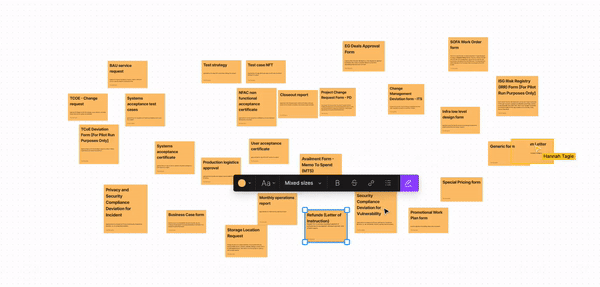
Card sorting activity done in FigJam
We continued to review the categories and made adjustments until we finally agreed on the final groupings. From 29 uncategorized memo templates, the entire team was able to create 7 categories in MemoPH.
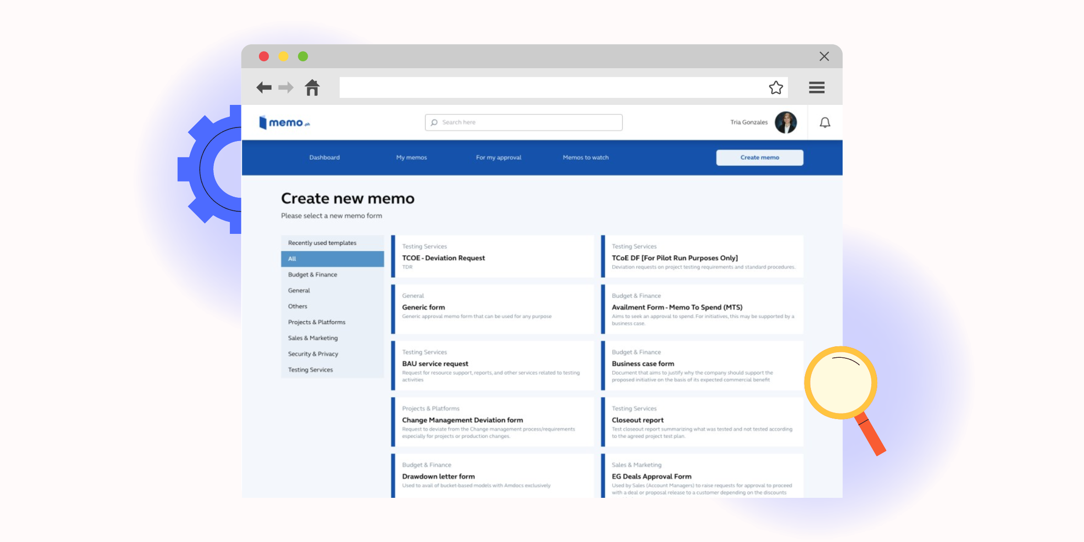
New template categories
From the card sorting exercise, we were able to translate our findings to the platform. I also included a short description for each memo template to give users an idea of its purpose. In addition, I added "All" and "Recently used" as options in the navigation of categories to provide flexibility and make it easy for users to recall previously used templates.
Positive feedback from our users affirm the success of our effort to enhance the memo process. The new template categories are able to make finding the memo template easier than before.
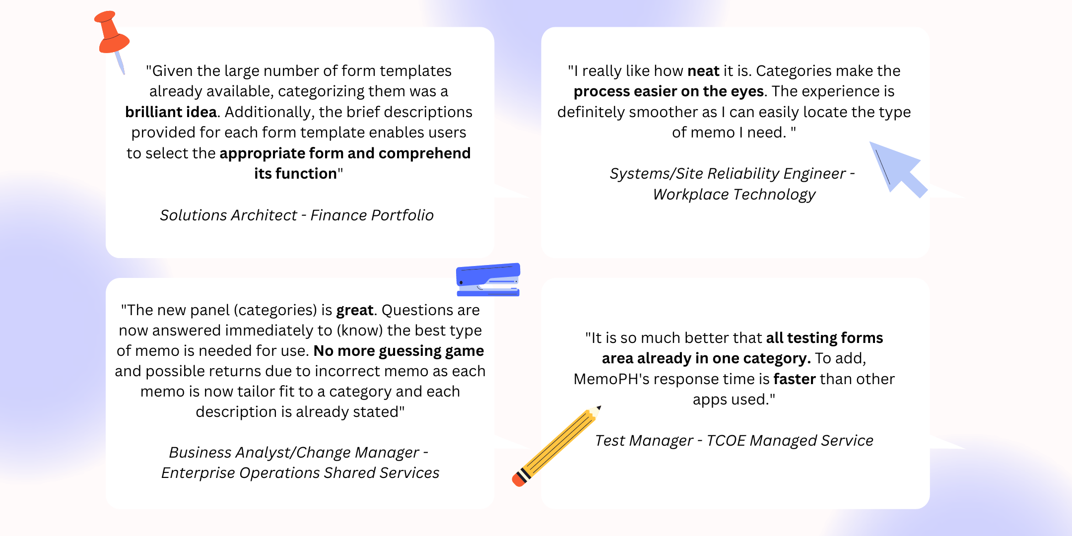
Some testimonials from the users regarding the template categories
Competitive analysis: Driving the redesign of the Admin Console's form builder
As part of the MemoPH team, I noticed that the form builder feature in the admin console was not aligned with the design standards of our company's UX team. I knew that this misalignment may compromise the user experience.
While it wasn't a top priority at that time, I still made the recommendation to have an enhanced design ready when the team had the capacity to work on it. This way, we could ensure that the admin console will be improved over time.
To support my recommendation, I conducted a comparative study. I started by checking out popular form builders like Google Forms, JotForm, and Typeform. I took note of their design elements and how they align with our company's design standards.
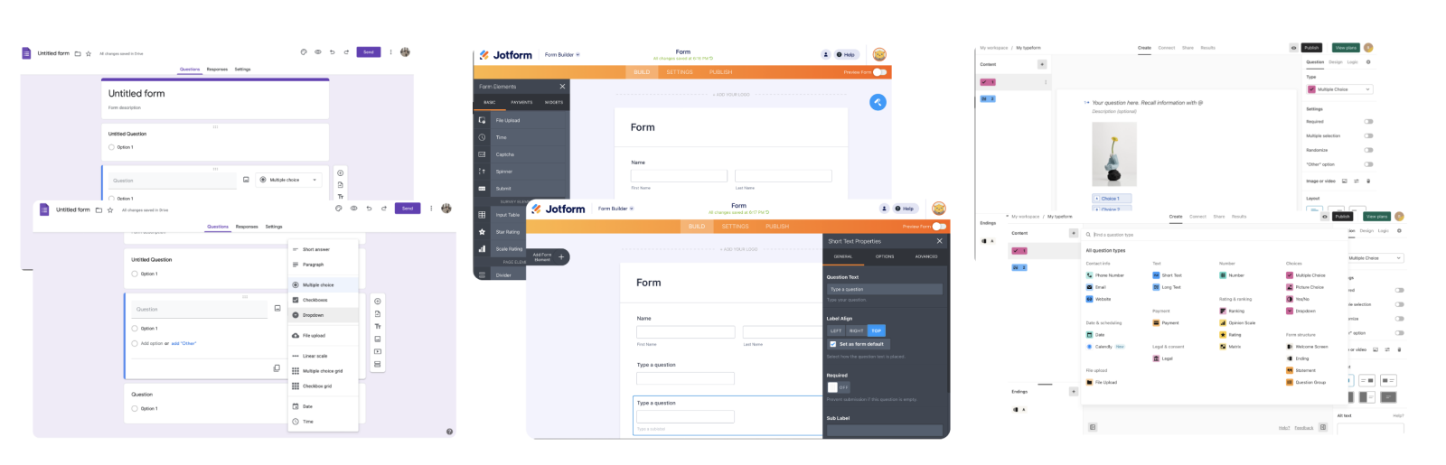
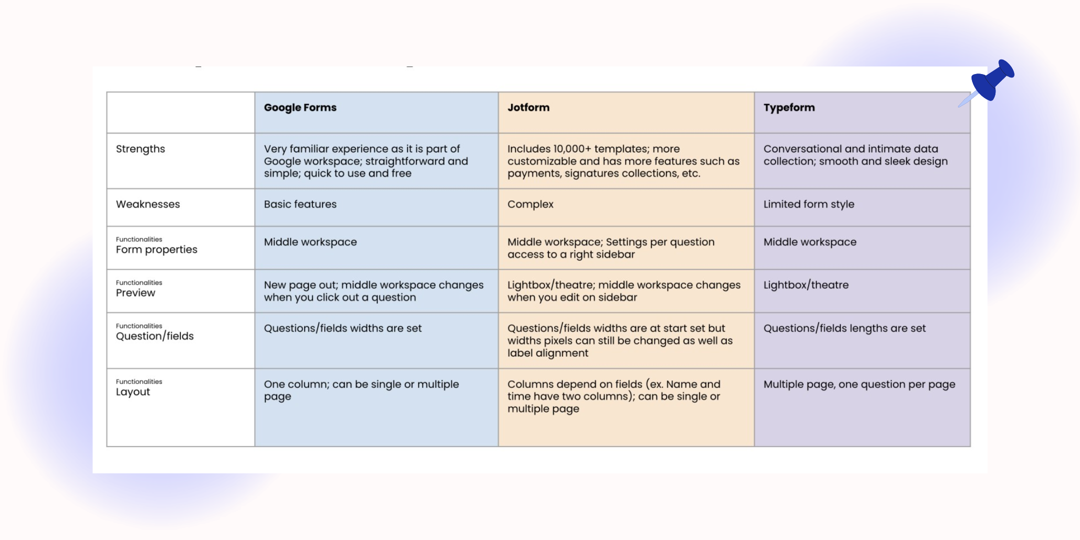
Compartive study on Google Forms, JotForm, and Typeform
I found that highlighting Jakob's Law could also greatly benefit our form builder feature. This law states that users spend most of their time on other sites, so they expect your site to work the same way.
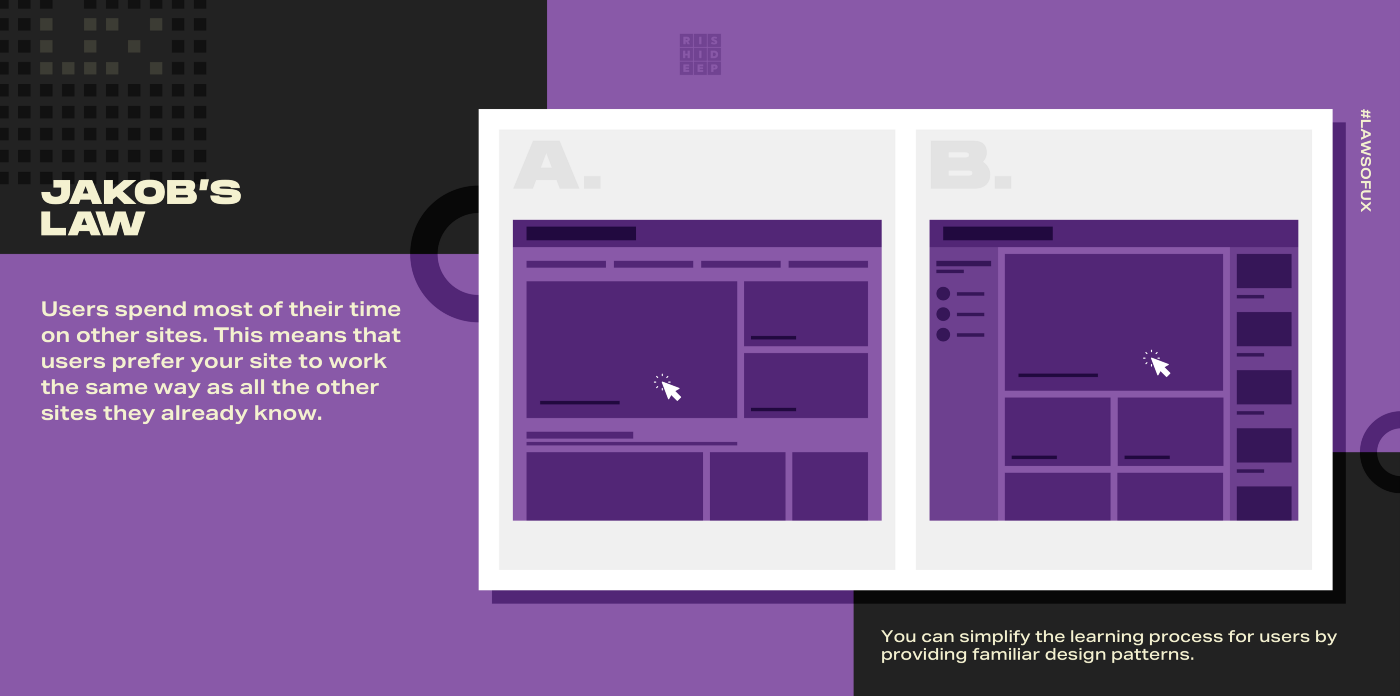
Application of one of the UX laws, Jakob's Law
Additionally, I created a user persona of the typical admin who will be using the console. Despite the absence of a formal survey, I was still able to gather valuable insights by interacting with team leads and observing their behaviors. Based on these, I was able to create a user persona that I believe accurately represents the needs and preferences of our admin console users. While a formal survey would have provided more comprehensive data, the persona still served as a useful support to make informed design decisions.
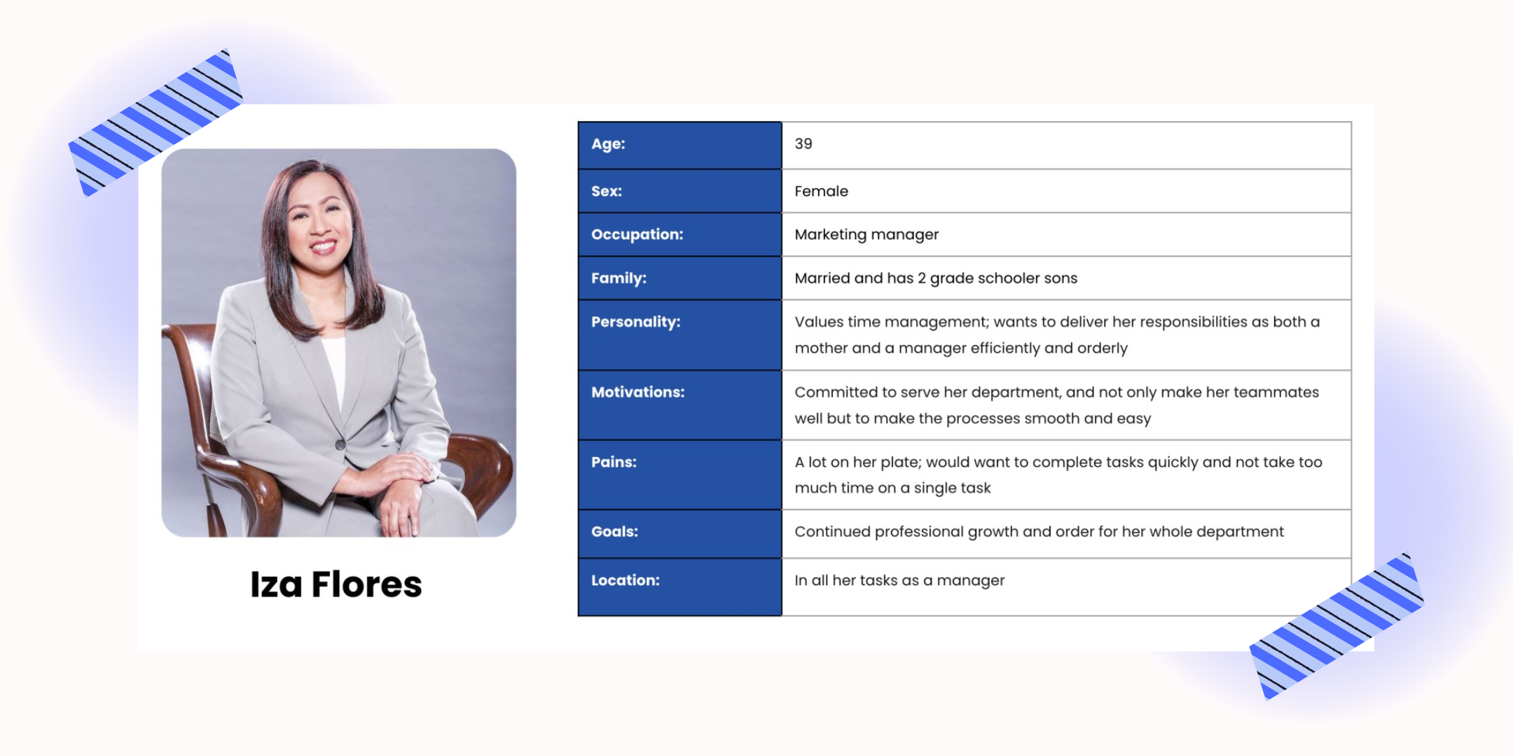
User persona of an Admin using the console
The redesign has resulted to a form builder that now includes a middle workspace, providing a clear and organized way to set up the memo template. It also includes an option to preview the form, giving admins the ability to see how the form will look and function before it goes live. Overall, the enhancements made to the form builder provide a more intuitive and efficient experience for admins
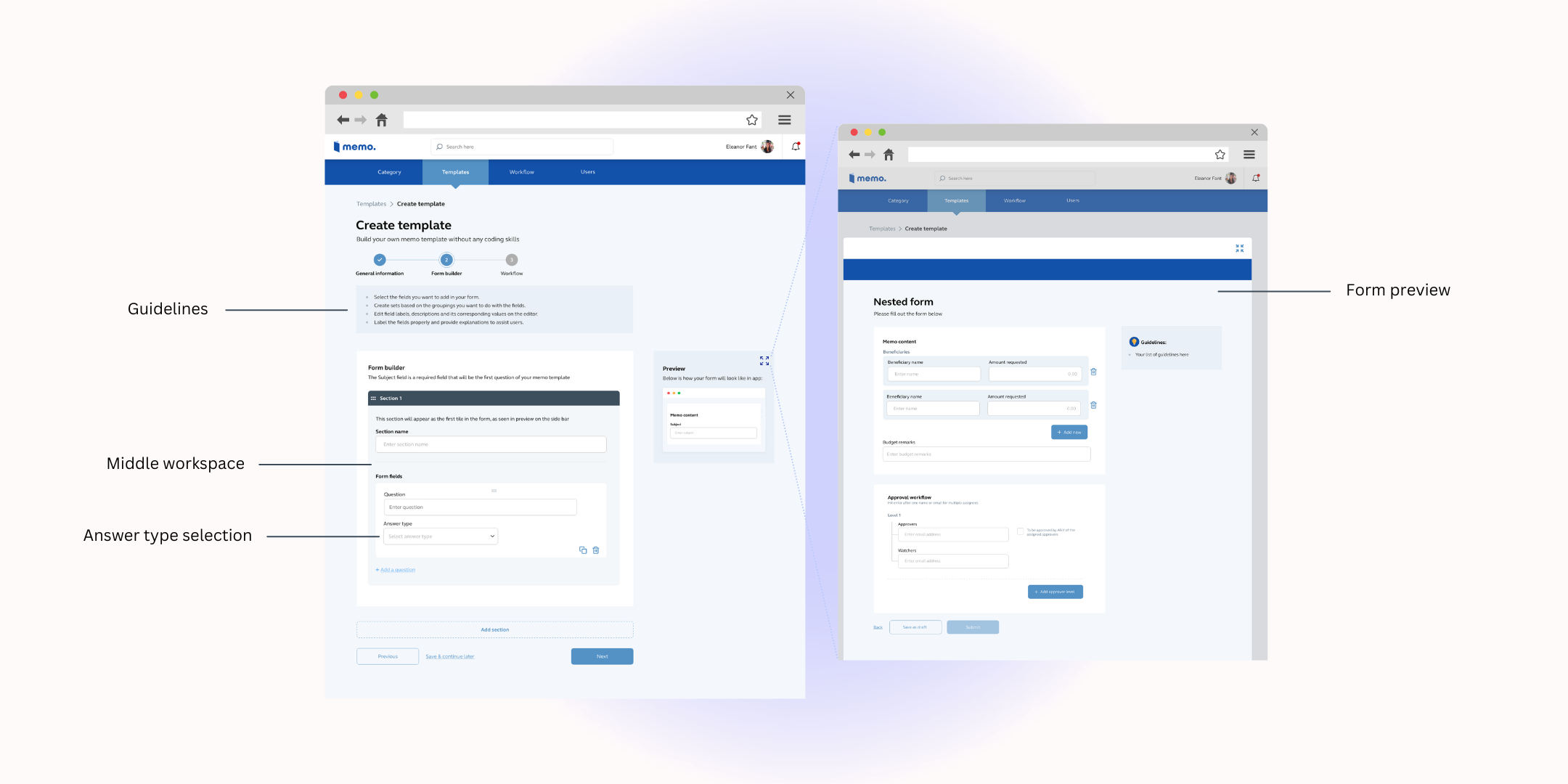
Redesigned admin console
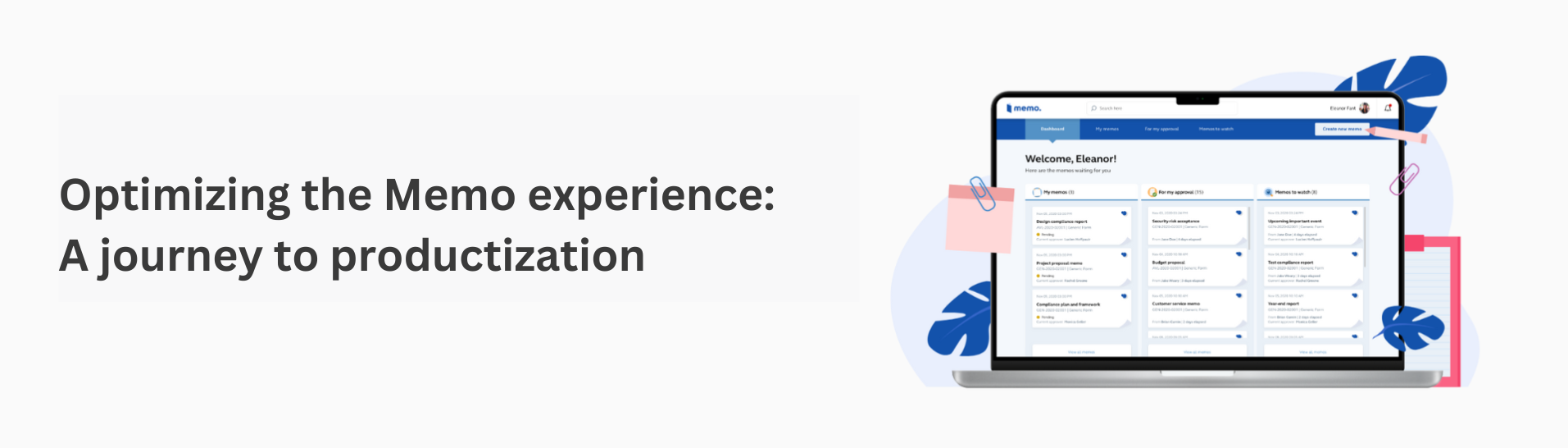
From idea to product: Launching Memo's product page
Creating a product page was an important step for the MemoPH team as we worked towards productization. In order to come up with the design, I searched for effective product pages from companies such as Google and Notion, which were inspiration for the look and feel of our own page.
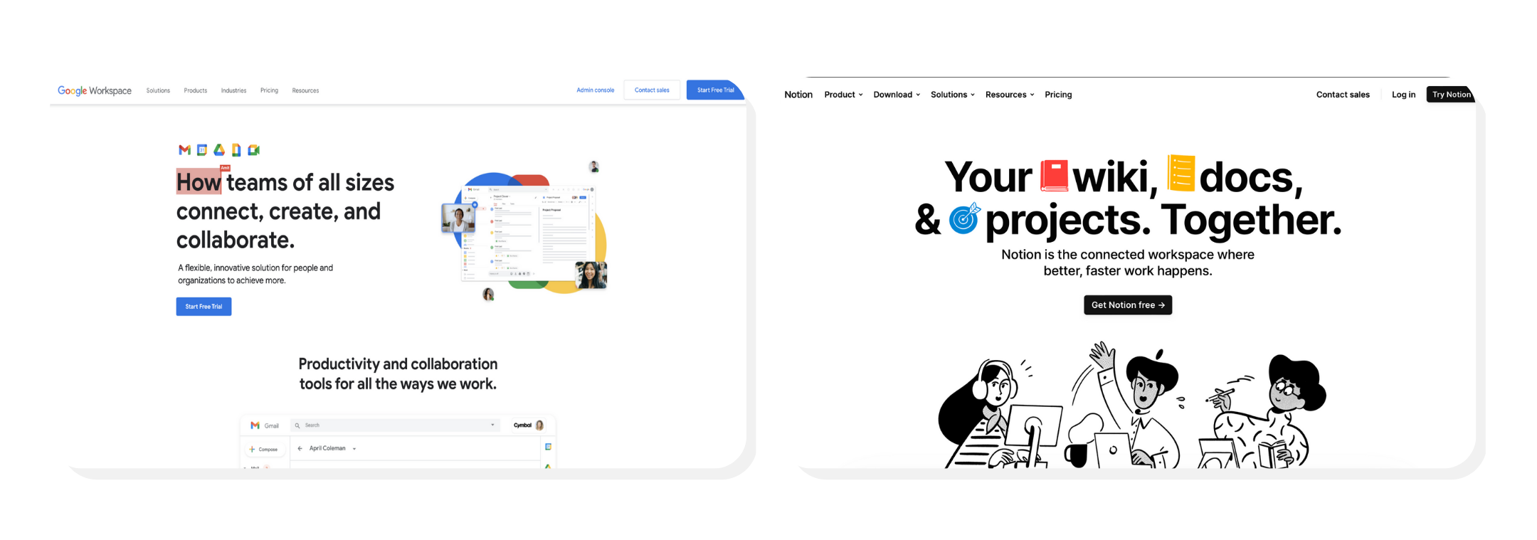
Product pages of Google Workspace and Notion
The product page itself is fairly simple. It mainly focuses on the features and previews of the interface. I also decided to include testimonials from our company executives, to help convey just how impactful the product has been. Finally, to complete the product page, we added a contact form to allow potential customers to reach out to us and discuss how our product can help them.
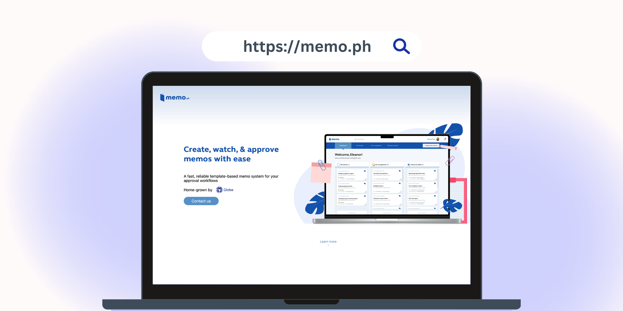
MemoPH product page
Creating this product page made me realize just how far we've come, and how much potential there is for MemoPH to continue growing and improving!
Transitioning to a new company: MemoApp
By March 2023, the product had evolved into a home-grown startup company. As a member of the original team, I contributed to the transition process and made several adjustments to integrate with the new company team, especially since it's now client-facing rather than internal employee-facing. It's a great feeling to see how far the product has come and to witness its transformation into a startup. My old team slash friends are still with them, so it's good that it feels like I was just working on it yesterday, and now they are serving clients! Currently, it is up and running, and you may view the official website You may view the official website here!
Project takeways
Looking back at the journey of the MemoPH team, it is so inspiring to see how it started as a department initiative that eventually grew into a widely used application by the company. The product was able to not only significantly reduce paper waste but also made memo approvals more efficient.
Now that it is productized, it is exciting to think about the potential for growth. As a team, we are constantly striving to improve the product and provide the best experience for our users. It is best to always practice continious improvmenet in your product. This means that you should regularly assess and evaluate to identify areas for improvement and make necessary changes. By doing so, you can ensure that the product meets the needs and expectations of the users, while also keeping up with evolving trends and technologies in the market.
Anticipating what lies ahead, I'm excited to see what's in store for MemoPH! It's not just a tool that we use internally anymore, but it is something that can help other companies with their own memo processes as well!
I am grateful for this opportunity to work with such a wonderful team at MemoPH. Lucien, Ivan, Corwyn, Xyza, and Ken, thank you for accepting me and making me feel welcome.
To my superiors, Juuya, Sha, and Hannah, thank you for always being there to answer my questions and helping me bring the best memo experience.
Lastly, I would like to acknowledge E, the previous designer of this product, for laying a strong foundation that contributed to the success of this project.